Aldiola
Country Resort
A booking form became a place you can picture yourself.
What we were looking at.
Aldiola Country Resort sits above Lake Liscia in the Gallura hills of Sardinia — a quiet, upscale retreat where the whole proposition is the place: the water, the light, the space between things. That is exactly what a website has to carry across before anyone thinks about dates.
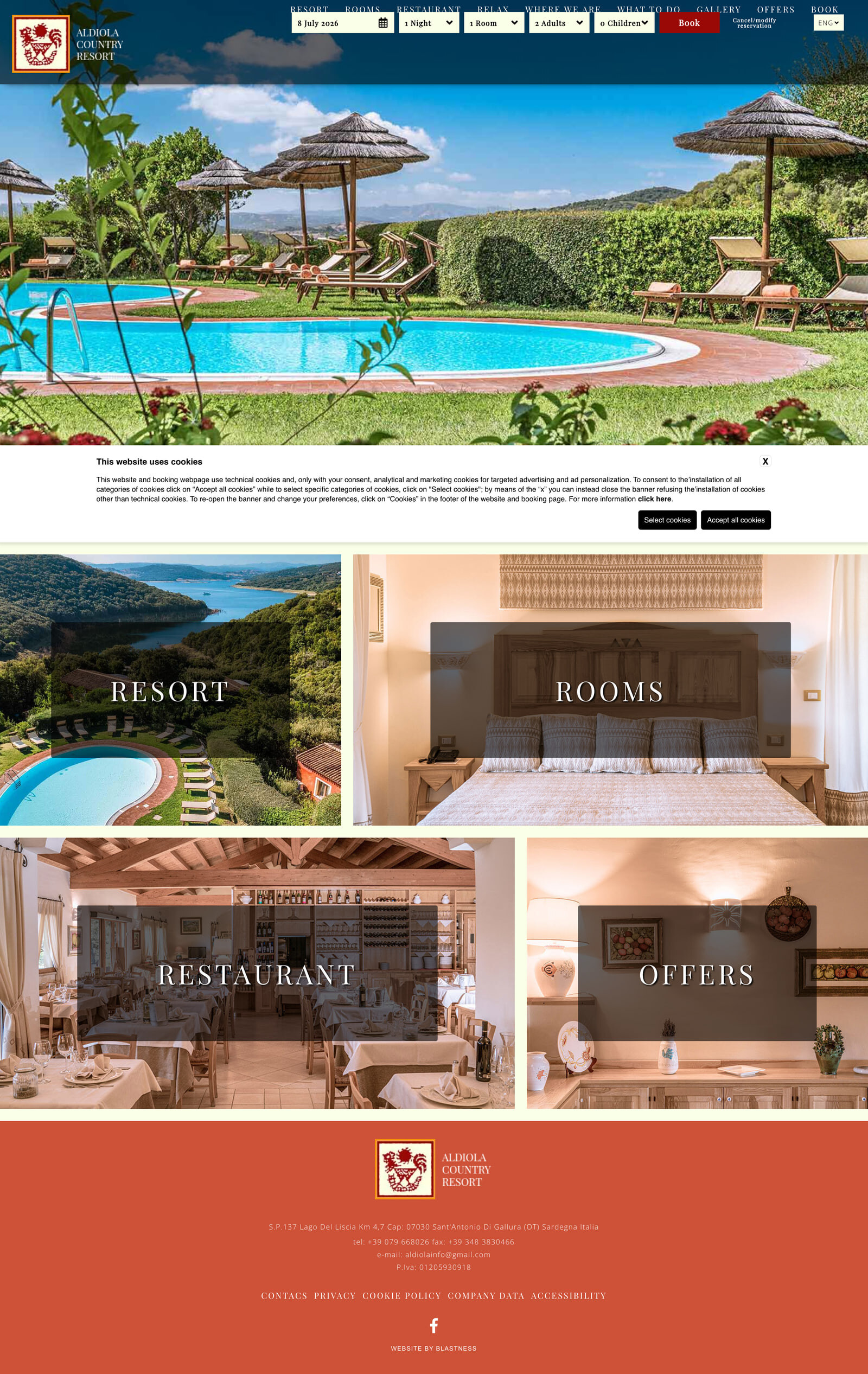
The site it had didn't do that. It ran on a Blastness booking template — the kind of hotel system where the reservation bar is bolted across the top and the property itself is squeezed underneath into a cramped 2×2 grid of thumbnails. Functional, but it led with the transaction and buried the reason to book. A guest arrived at a form, not at a view.
So this rebuild is not a reskin of that template. It's a full reconstruction that reorders the priorities — put the place first, let the rooms and the table follow, and keep exactly one clear path to reserving. Everything below was rebuilt by hand from the real content and freshly captured from the live build.
The homepage, both ways.
Drag the line. Left is the real site as it stood; right is the rebuilt homepage, freshly captured. Same business — a different first impression.

Every page we rebuilt.
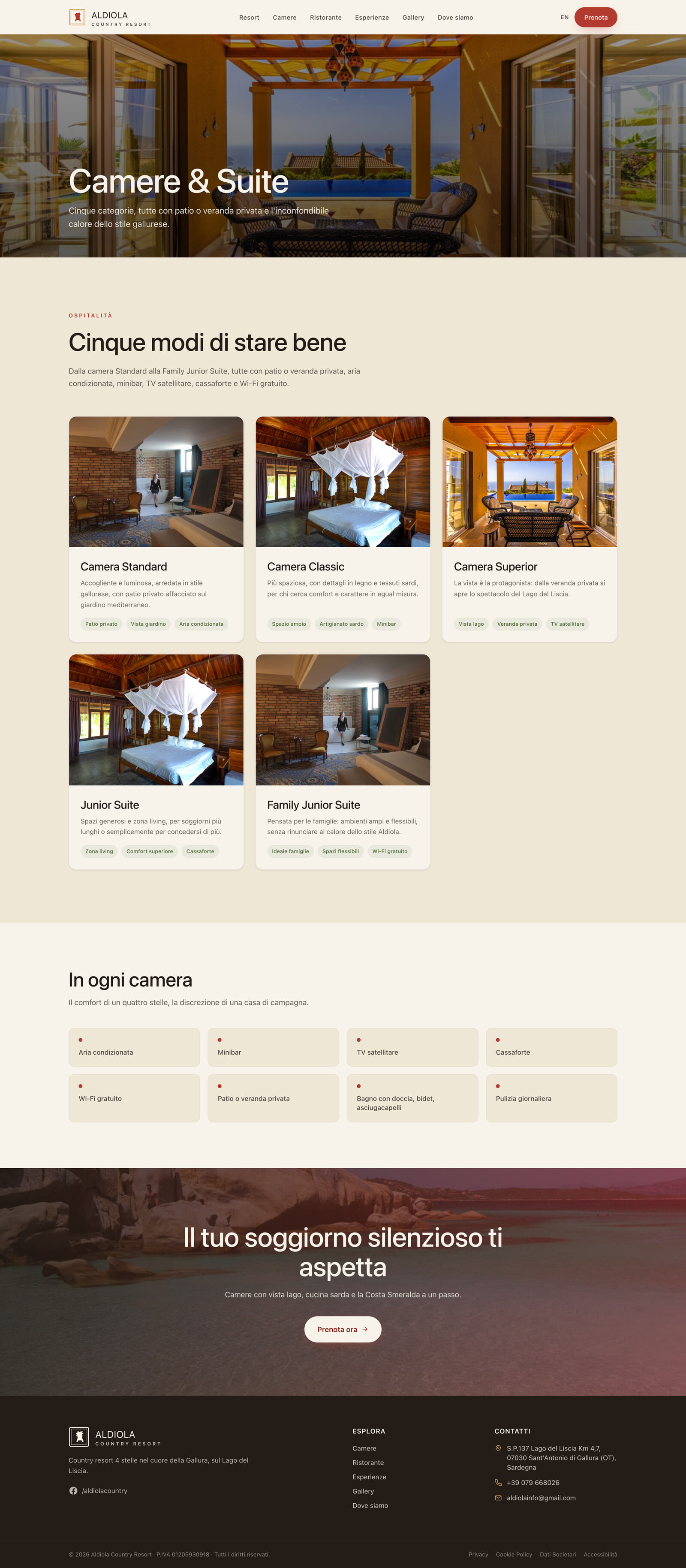
Not just the homepage. Each panel below is a full page — hover a frame to let it scroll, or open the full capture. This is where a redesign is really judged.
A lake, not a booking bar
The homepage now opens on a full-bleed Lake Liscia hero instead of a reservation widget over a thumbnail grid. From there it reads as an editorial scroll — place, then rooms, then dining — so a guest feels the resort before they're asked to commit to dates. One reservation path stays present without shouting.
Rooms shown at full size
The rooms page gives each room room. Large, honest photography and a calm, consistent layout replace the boxed template tiles, so the difference between categories is legible at a glance — and the same single reservation action carries through, rather than a new form per page.
The table as its own draw
Dining is treated as a reason to come, not a footnote. The restaurant gets an editorial page in the same visual language as the rest of the site, so the kitchen and the setting feel like part of the stay — closing the place → rooms → dining arc the homepage sets up.

The decisions behind it.
The whole rebuild followed one instinct: lead with the place, and let the booking be the easy last step rather than the first hurdle.
Replaced the booking-first template
Retired the Blastness booking-bar-over-a-tile-grid layout and rebuilt the site around the property itself — the reservation path stays, but it no longer opens the story.
A full-bleed editorial hero
The homepage leads with Lake Liscia at full width, giving the resort the first impression its setting deserves before any transactional detail appears.
A place → rooms → dining scroll
Content was re-sequenced into a deliberate editorial order so a guest is walked through the experience the way they'd actually arrive at it.
One clear reservation path
Instead of a booking form on every surface, the rebuild keeps a single, consistent way to reserve — present throughout, intrusive nowhere.
Currently accepting one project
Have a site that
needs this too?
If you run a place where the setting is half the product — a hotel, a retreat, a room with a view — and the website leads with a form instead of the view, that's the exact gap this rebuild closed.
Start a project ↗