CORSO
Sölden
Three businesses, three doors, one alpine-modern home.
What we were looking at.
CORSO is a family-run operation in Sölden, in the Austrian Tyrol — really three things under one name: a restaurant, an aparthotel, and a bed-and-breakfast. That's a genuinely hard thing to present, because a visitor might arrive wanting any one of the three and shouldn't have to untangle the other two to get there.
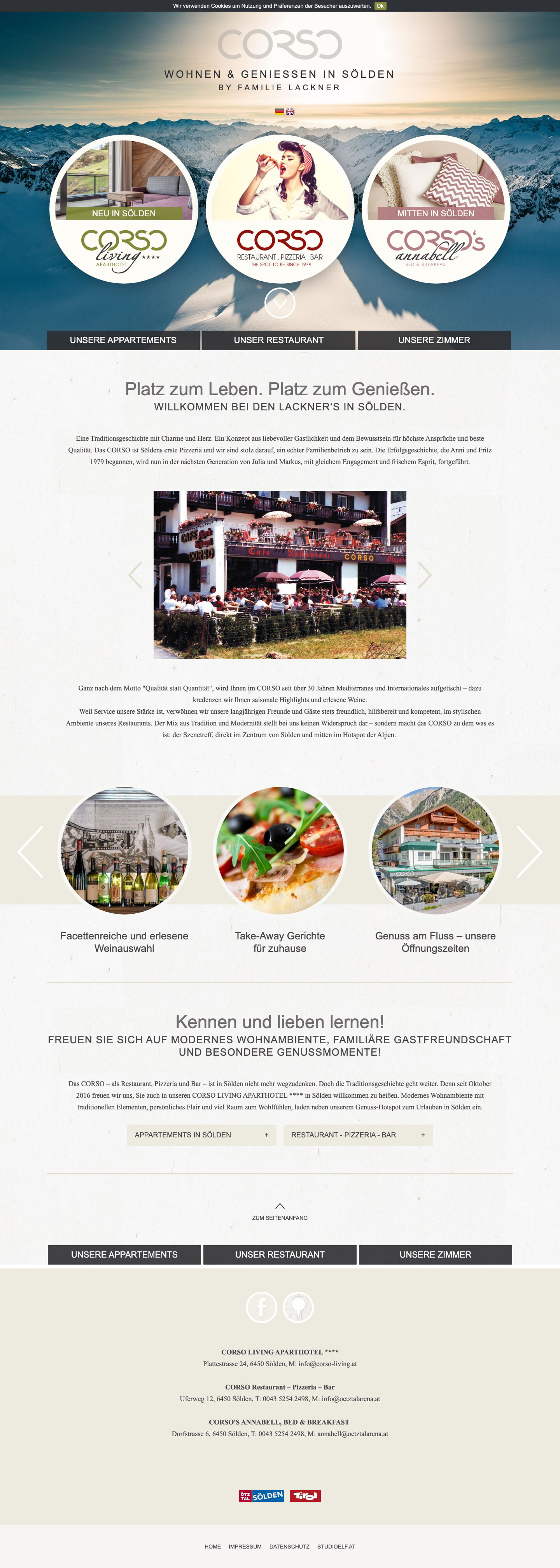
The old site made it harder than it needed to be. It was a circa-2014 TYPO3 template — the era of circle badges, tight columns and small stock-feeling imagery. It worked, but it flattened three distinct offers into one dated page, and the mountains that are the whole reason to be in Sölden barely made it onto the screen.
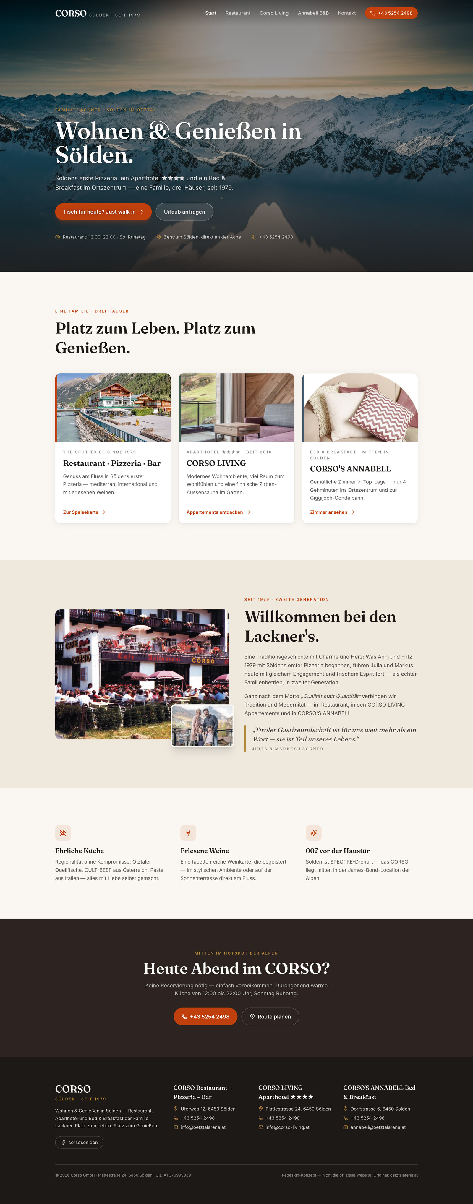
The rebuild reframes CORSO as three doors under one roof. A single alpine-modern home, full-bleed photography that actually shows Sölden, a clear per-house route for restaurant and rooms, and a walk-in / call action that stays with you — because a small family business lives on the phone ringing and the door opening.
The homepage, both ways.
Drag the line. Left is the real site as it stood; right is the rebuilt homepage, freshly captured. Same business — a different first impression.
Every page we rebuilt.
Not just the homepage. Each panel below is a full page — hover a frame to let it scroll, or open the full capture. This is where a redesign is really judged.
One home, three clear doors
The homepage stops trying to be everything at once. It opens with full-bleed alpine photography and then offers three obvious doors — eat, stay, B&B — so a visitor self-sorts in a second instead of scrolling a dated single column. The circle-badge TYPO3 look is gone entirely.
The menu, actually on the page
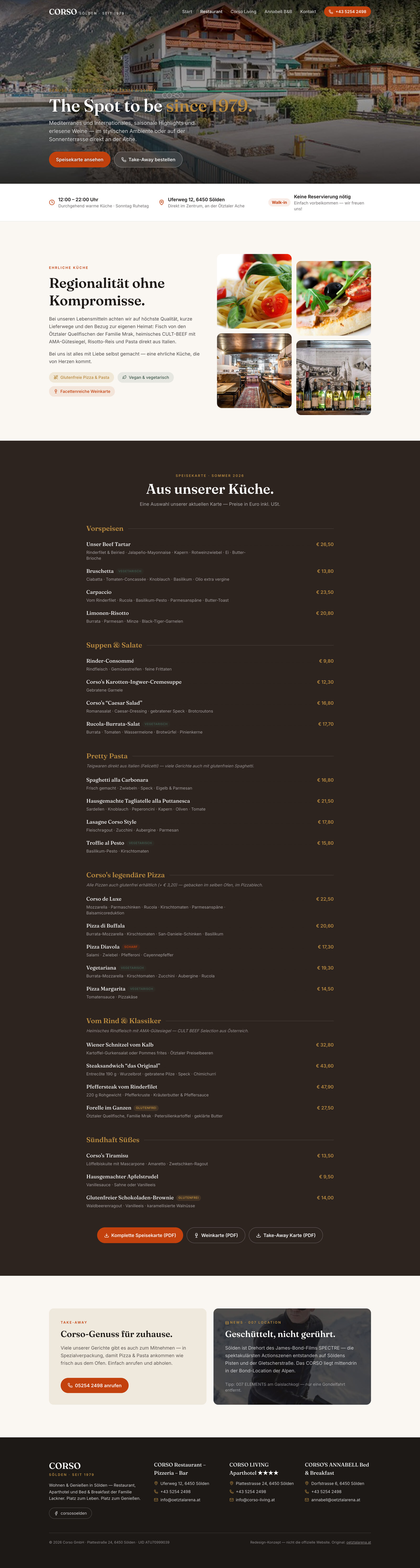
The restaurant gets its own page with the menu read directly on-screen, not buried in a PDF or a side note. A persistent walk-in / call CTA means a hungry visitor is always one tap from a table — the thing that matters most for a place people decide on in the moment.
Per-house, not one blur
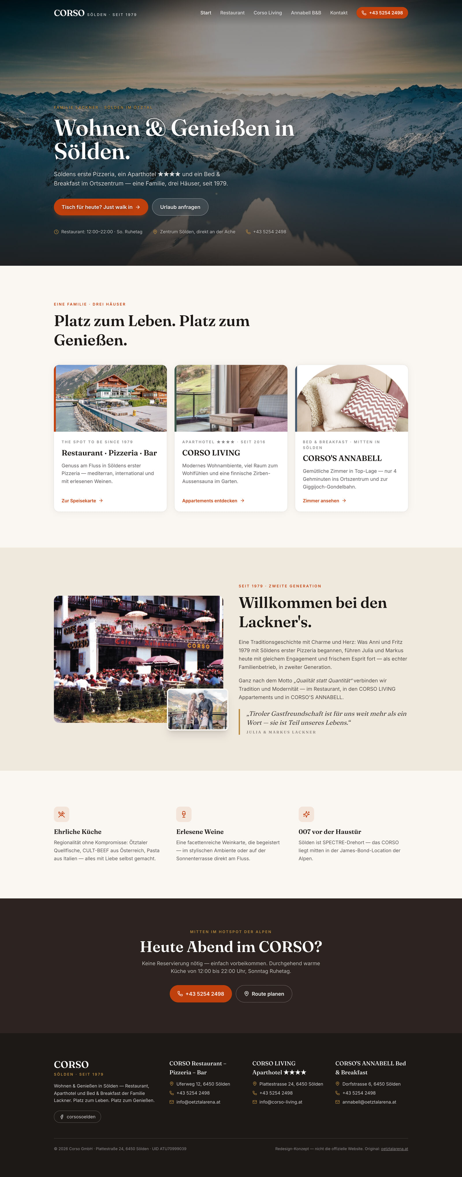
Rooms are presented per-house so the aparthotel and the B&B read as distinct choices rather than a single fuzzy 'accommodation' block. Consistent alpine-modern styling ties them back to the same brand while keeping each offer legible on its own terms.
The decisions behind it.
A family business with three offers needs a site that sorts people fast — so the whole rebuild is built around getting each visitor to the right door without friction.
Left the 2014 TYPO3 era behind
Retired the circle-badge template and its cramped columns for a single coherent alpine-modern system built for the three-in-one reality of the business.
A 'three doors' home
The homepage routes restaurant, aparthotel and B&B as distinct, obvious choices instead of collapsing them into one dated page.
Full-bleed mountain photography
Sölden is the reason people come — the rebuild puts real, large photography of it front and centre where the old stock imagery used to sit.
A persistent walk-in / call CTA
For a family-run place, a ringing phone and an open door are the business. The rebuild keeps that action within reach on every page.
Currently accepting one project
Have a site that
needs this too?
If you run more than one thing under a single name — a kitchen and rooms, a shop and a service — and the website makes visitors do the sorting, this is the kind of rebuild that puts each of them at the right door.
Start a project ↗